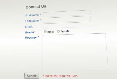
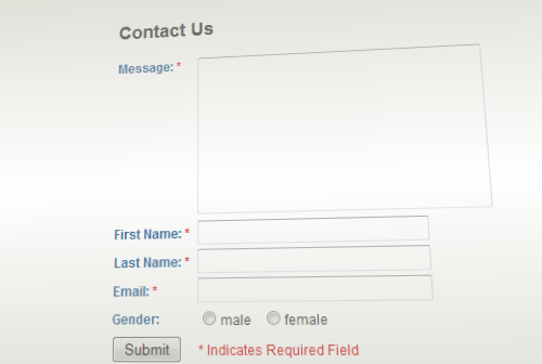
Good web design is not about pretty pictures. Neither is it about using web standards. It’s about having a user-centric, task-focused philosophy.
What does that mean?
It means instead of starting your design with a mental picture of what everyone else does, or what people say you ‘should’ be doing, or what you’ve done in the past, or what you can make money from, you instead start from what the user wants to achieve. You focus your entire site on connecting users with solutions to their problems.

A great example of task-focused design is Google’s homepage. The user’s task is “I want to find information”, so the dominant feature on the page is the search query box. That makes sense. It’s not a particularly pretty page, it’s not even a web-standards compliant page, Google don’t make any money directly from the homepage, and it’s certainly not there via an examination of what their competition are doing.
It’s there because Google know that great web design is centered solidly around building sites which enable their users to complete the tasks they want to. Solving a user’s problem is delivering a great experience. Sites which deliver great experiences tend to do well. It’s that simple. Google’s homepage funnels users into a highly optimised revenue-generating page by presenting users with a UI which allows them to solve their pain very quickly. Google instant and auto-suggest all feed into this philosophy of reducing the amount of time the user’s problem is unsolved for.
Back to the humble contact form. What is the user’s pain that you’re solving, the task that your task-centric UI is solving? For contact forms, it’s easy – the user wants to send you a message, that’s why they came to your contact form.

So why is it that the first thing your contact form asks the user to do is to type their name? Ok says the user, I’ll type my name. Now can I give you my message? No, we need your email address too. Ok fine, here you go, can I type a message now? No, we need you to fill in this dropdown so we can route your enquiry to the right department. And so on and on and on, putting ever-more barriers between the user and the task they’re trying to accomplish.
The contact form for the White House has thirteen fields to fill out before the user gets to start the task they came there to do! Thirteen!
So here’s the ridiculously simple solution I advocate: Put the message field first.

This way the user completes their task as early in the process as possible. Once they’ve entered their message, there’s a mental tickbox in their head saying “task complete”, and that makes your users happy. It makes your site pleasurable to use. It’s user-centric design.
In the case of our contact form, it also means that when you ask them for the other information, they’ve already invested their time and mental effort writing you a message, so they’re now much less likely to abandon the form when you ask them for those thirteen other pieces of information.
You can apply this philosophy in other areas of your user experience – Amazon use a similar strategy; they allow you to add things to your shopping basket without being logged in. It’s only when you get to the checkout page that you’re asked to log in. Because you’ve invested the time and effort selecting products, you’re less likely to abandon your cart than if they required you to log in before filling your cart. Likewise with ebay, you can actually watch items without being logged in. It’s only when you’ve already begun solving your task that you’re asked to register or log in.
So this post has been a little bit about contact forms, but also I’ve been setting forth a general UX philosophy to use across your whole site. Examine each part of your site and ask “How can I reduce the amount of time between the user expressing a problem and me solving it”. If you have a quantity box on your product widgets, make sure it’s prepopulated to ’1′ not ’0′, likewise make sure that any option dropdowns have an option preselected instead of saying “Choose Colour” as the default. Make the experience as smooth as possible. See every click and keystroke as an obstacle that should be removed if possible.
It’s not just about choosing defaults, it’s about your site navigation and look-and-feel as well. Do users need to be logged in to comment or can you remove that barrier? When browsing dresses, do you also feature prominent links to hats, or would the user have to go right back up the product hierarchy to find a hat that goes with their dress? Can you add an item to your cart in one click? One click from the homepage? When users are registering, do they have to fill out a huge form, or do you just ask for their name and email address and then ask for one extra detail when they next log in, with a “profile 25% complete” display? Do you have to click exactly on the text on your navigation links, or is the background clickable too, increasing the click target area? Do you use ajax loaded content to speed your site up where possible? When you add a product to your cart, does the entire page reload, or does the product widget change into a “product added to cart” notification via ajax? Do your dialogs auto-dismiss after 5 seconds (or better: on mouse enter of the dialog) or do you require the user to click the poky little OK button?
Examine every little part of your site and use the technologies we have available to speed up the flow, both in terms of literal milliseconds, and in conceptual units of clicks and other user actions. Break away from the idea of a website as a sequence of single pages, and move towards the idea of a website as a single application which responds to the actions that the particular user is performing. That’s responsive UI, and it’s the future of the web.
Update: yes yes, my own comment form doesn’t follow the advice, I am working on it, but try not to let that distract you from the over-all message :)


#1 by Jon Keating on July 4, 2011 - 10:21 am
What about comment forms, like the one that I’m typing in right now? The comment is the very last field presented to the user.
#2 by Jon Keating on July 4, 2011 - 10:22 am
Just saw your update now :)
#3 by movedgraph on July 4, 2011 - 11:28 am
^ lol :)
#4 by foo on July 4, 2011 - 12:09 pm
Speaking of serving the user, why is it ok to demand information that is irrelevant to ME? Like my name? Why MUST you know my name. A contact form should only require an email address and provide space for the message. END OF STORY. The rest of the info is for the website owners needs, not mine. I don’t care about your needs.
#5 by Thomas Madia on July 4, 2011 - 12:20 pm
I see my comment was removed, but I was just pointing out the same mistake on your blog commentig system, anyway, I will follow your advice and redesign my contact us page on my websites.
#6 by Howard Yeend on July 4, 2011 - 2:11 pm
Sorry, I was hit by about 5 comments on the same topic and decided an update to the article was better than a reply to each.
Great to hear you’re going to give it a shot – let me know how it works out and if you notice any difference. Cheers!
#7 by Thomas Madia on July 4, 2011 - 2:25 pm
I will provide feedback after a week or two, thanks again for the advice, I also like the fact that I don’t have to refill my info again when I make subsequent comments on this blog.
#8 by ⬡ on July 4, 2011 - 2:07 pm
You make some good points about UI design, but I really don’t see the advantage of something like moving the comment box to the top. It’s not as if it’s hard to miss. If you’re that desperate to write your message right now because you fear you’ll forget if you have to remember your name first, it’s pretty easy to just click on that box instead, then go back up to fill in the other info.
Now, a comment form with 13 different fields in it is just wrong, no matter how those fields are ordered.
What annoys the crap out of me is comment forms that require Javascript, or require logging in but show up when you’re not logged in (and many don’t give any indication at all that they won’t work until you’ve already typed up and submitted your comment!), and those where pressing tab goes to the top of the page instead of the submit button. Incidentally, this one makes both of those mistakes!
#9 by ⬡ on July 4, 2011 - 2:14 pm
On a related note, there’s a similar UI design failure trap that’s easy to fall into if you put the comment form first. A few times I’ve run across pages that present a large form with many fields (or just a form in a popup window), such that you have to scroll down to see them all – and when you get to the bottom, after filling in all those fields, you see the “login” section. Oh great, I just wasted all that time filling out this form and now you tell me I need to have an account first! Gee, wish I’d known that earlier!
Making the user do work (e.g. filling out a form) only to throw it out is a completely unacceptable UI design failure; thus you should always make sure the user knows what they have to do (e.g. register an account) before doing the work. Which, for a comment form, means having all authentication fields before the actual comment box. Writing a comment on a blog may not seem like much work, but it’s still hella annoying when you find out only after doing it that you wasted your time.
#10 by peter on July 4, 2011 - 3:02 pm
i totally agree. see my comment below.
i’d personally shoot every product manager who’s suggesting follow the late-sign-up principle for the sake of generating new users.
for example, getsatisfaction.com (1) really sucks due to this. which is particularly tragic if you’re actually in the business of improving the user experience.
(1) no, i won’t ever create an account there. after the first frustrating experience, i’ve decided to simply not use any service that uses getsatisfaction for customer feedback. it’s not worth my time, really.
#11 by peter on July 4, 2011 - 2:55 pm
i understand your concerns and argumentation, but the proposed solution is utter bs, sorry.
there’s nothing more sucky than spending 10 minutes to write a feedback or comment, and then later find out that one needs to enter a plethora of details to actually send it off.
or if you want to really piss off people, do it like more and more walled web gardens do (unfortunately and egoistically), for example getsatisfaction.com, by requiring users to sign-up to send their comments (of course, don’t tell them about this little fact beforehand, only after they already invested their precious time to write a comment).
so, best would be to simply keep the barrier as low as possible, no matter in what order. not every commenter is interested in actually getting a personal feedback (they could just as well get back to the comment page later and read an answer). so don’t make entering an e-mail or name mandatory (but offer it as an option for those who care). and don’t ask for details that really aren’t necessary to get value out of a customer feedback. so, no gender field, no post address, no whatever.
it’s that simple, really.
#12 by peter on July 4, 2011 - 3:10 pm
maybe i should explain this. my reasoning for boycotting any service that uses getsatisfaction is the following:
a company that decides to use getsatisfaction, obviously decides to value their own time and convenience higher than that of their customers. which is a really bad attitude and a sign that the management doesn’t really understand the importance of usability and customer service. so, it’s no surprise that usually, the web offers of those companies already suck anyway. fortunately, for every web service out there, there are at least a dozen competitors. those that demonstrate that they have the right focus will get my time and attention.
#13 by Trung Huynh on July 4, 2011 - 4:10 pm
I haven’t read thru your post yet but had a look at the form you advocate. Just wondering if its better to have “Full name” rather than separated “First Name” and “Last Name”, and why would you want user to choose “Gender”? If you have the name, can you guess their gender with a good probability?
#14 by Howard on July 4, 2011 - 4:26 pm
Yes I agree – the form I used in the screenshot was just the first result on google for “contact form”. I don’t see the point of separating first and last names, or of asking for gender either.
#15 by Evan Skuthorpe on July 4, 2011 - 5:05 pm
we’ve been doing this for some time now. why people continue to put barriers in the way of their customers/readers is beyond me.
#16 by Buzu on July 4, 2011 - 6:07 pm
“Break away from the idea of a website as a sequence of single pages, and move towards the idea of a website as a single application which responds to the actions that the particular user is performing. That’s responsive UI, and it’s the future of the web.”
That might be one of the best pieces of texts I’ve read lately.
PS. Why haven’t you done what you suggest with your site? (i.e. The message box first)
#17 by malena on July 21, 2011 - 4:54 pm
Great post! I love this solution as simple and obvious as it may seem. I will definitely keep this in mind for any other areas this technique would work for. Thanks for sharing :)
#18 by Mr. happyday on July 27, 2011 - 9:37 am
Great post, with a nice solution to a problem that I think most people doesn’t see at all.
Another solution is only to show the message field and after the user clicks the “send” button ask for the name and e-mail.
#19 by Matthias on September 8, 2011 - 6:33 pm
I actually have no problem with the representation of the form, but your idea is still somewhat better than the original. I would grab the first name and last name in a field.
#20 by Kasper on April 23, 2012 - 1:04 am
Great article, makes u think more about the user experience.
I can see that you have not chosen to change the name, email and website after the message box, any reason for that ?